
Design as the Heart of the LESENOK Brand
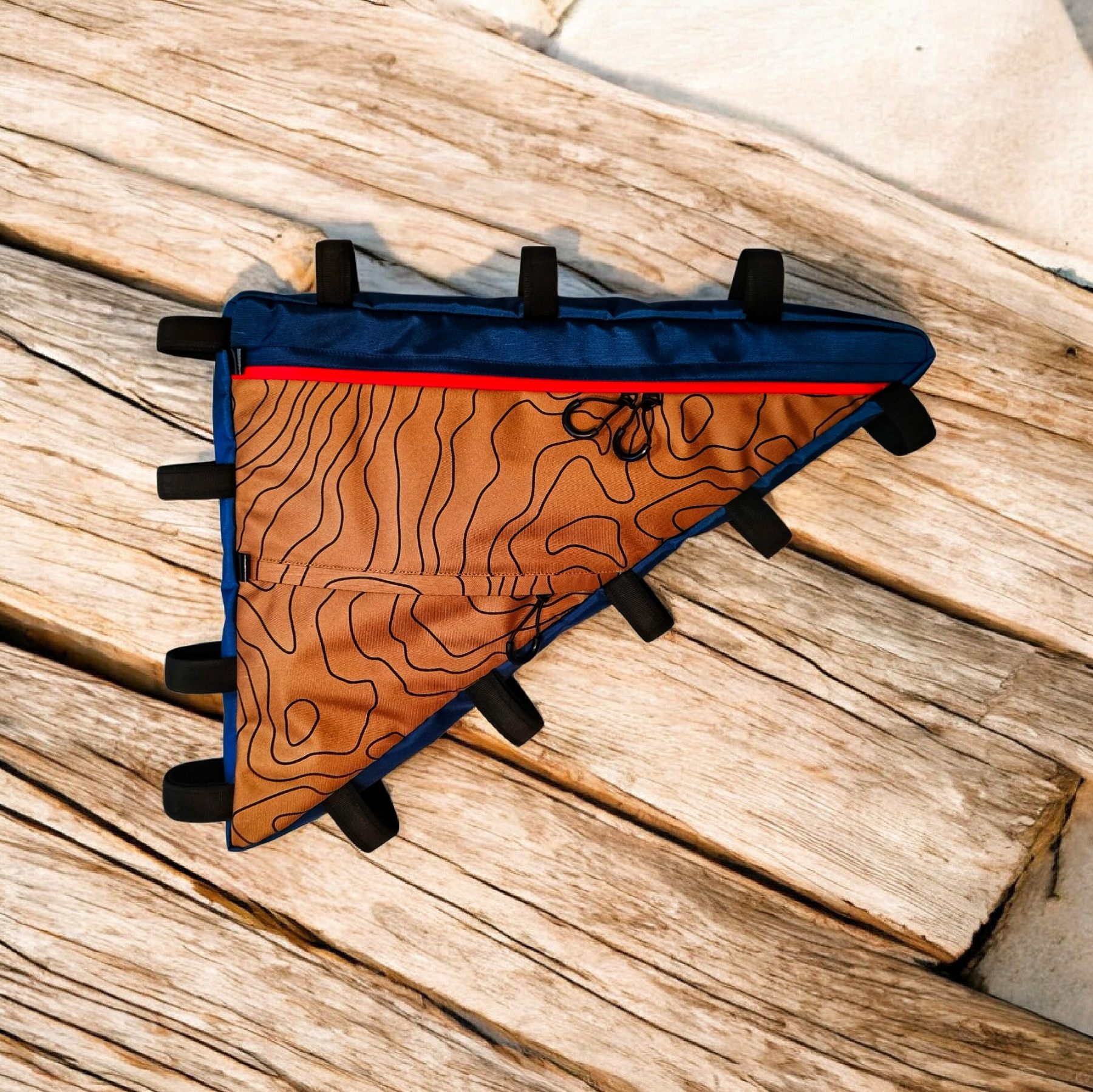
<p>Design as the Foundation of the Brand</p><p>At the core of LESENOK lies an original design — the heart of the brand and its visual language.</p><p>Through this design, LESENOK speaks about movement, journey, and the connection between a person and space.</p><p>The lines combine the structure of a tree, roads and trails, and topographic relief.</p><p>This is not decoration or a trend — it is a visual code of the route, where the process of movement matters as much as the destination.</p><p>The signature design unites all models and color choices into one system, preserving the integrity of the brand as it grows.</p><p>At the core of LESENOK lies an original design — the heart of the brand and its visual identity.</p><p>Through this design, the brand speaks about movement, journey, and the connection between a person and space.</p><p>It brings together images that are deeply rooted in the philosophy of travel:</p><p>the structure of a tree</p><p>roads and trails</p><p>topographic lines and natural relief</p><p>This is not decoration and not a trend.</p><p>It is a visual language through which LESENOK tells a story about direction, route choice, and the feeling of space.</p><p>The Meaning of Structure</p><p>The lines of the LESENOK signature design are not accidental.</p><p>They echo:</p><p>the rings of a tree — a symbol of time and accumulated experience</p><p>the interweaving of roads — the freedom to choose one’s own path</p><p>topographic contours — movement within the terrain, not above it</p><p>This visual code expresses the idea of a journey where the process itself matters as much as the destination.</p><p>The Heart of the Brand</p><p>The original design is the unchanging core of LESENOK.</p><p>It connects all collections, formats, and color solutions into one coherent system, preserving the integrity of the brand.</p><p>Thanks to this design, LESENOK remains recognizable regardless of how models, materials, or usage scenarios evolve.</p><p>Responsibility and Continuity</p><p>Original design is not only about aesthetics — it is also about responsibility.</p><p>It is created not for a single season, but with long-term use and the future development of the brand in mind.</p><p>LESENOK grows while preserving its form — just as a tree keeps the structure of its rings over the years.</p><p>These lines resemble maps, terrain, and the natural rhythm of movement that cyclists encounter in both journeys and everyday rides.</p><p>The design is conceived as a visual continuation of the bikepacking idea — moving deeper into space, not merely across its surface.</p><p>This signature pattern is the heart of the LESENOK brand, uniting different models, formats, and colorways into one system.</p><p>Personalization as an Extension of Color</p><p>Some LESENOK models offer personalization — the ability to adjust color or size.</p><p>This is not about indulgence. It is about recognizing that every route is different.</p><p>Color can be adapted to:</p><p>the bicycle</p><p>the riding style</p><p>the environment</p><p>a personal sense of the journey</p><p>LESENOK — When Color Matters</p><p>We believe that gear should not be faceless.</p><p>It should support movement, mood, and personal choice.</p><p>Color at LESENOK stands for:</p><p>freedom</p><p>confidence</p><p>a living connection to the road</p><p>That is why our bags are often recognized even before the logo is noticed.</p><p>One Unified Logic</p><p>No matter where this design appears —</p><p>on bags, accessories, or in communication —</p><p>it always speaks about the same thing:</p><p>movement</p><p>journey</p><p>structure</p><p>the ability to hold form even in complex terrain</p><p>This is not just a print.</p><p>It is a visual code of the route....</p><p><br></p><div><br></div><div><br></div><div><br></div>
No comments yet.